Here is my first attempt at my magazine mockup and writeup. 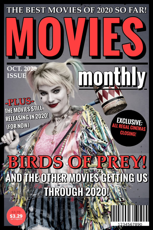 Title/Masthead: The title/masthead is “Movies Monthly” which literally means it is a movie magazine published once a month. The title suggests that it is a publication that primarily focuses on reporting current film, television, and entertainment information, with an emphasis on film.
Typography: The typography suggests that the magazine’s primary focus is on movies, which I (hopefully) achieved by typing the word “movies” larger than the other words, and typing it in all caps for emphasis. I also colored it in with the reddish pink color, which was used on particular words to draw the reader’s attention. I tried to give the magazine an inviting tone, so instead of using a bright red I tried to use a subtle color that was easier on the eyes. I also tried to give the magazine a mature tone/attitude by using fairly conventional fonts. Image: For the cover image I chose a human figure, that being Margot Robbie. She is dressed in costume as Harley Quinn, a character she played in Birds of Prey. She was posed or angled slightly to the left to prevent her from being blocked by the masthead. I also framed her over the black border instead of behind it to emphasize that she was the main focus of the magazine cover. I turned down the saturation on Harley Quinn quite a bit, because her costume was very bright, and distracted from the inviting tone I was going for. The subject (Harley) addresses the reader directly, because in the image I used she is staring directly at the camera, as opposed to staring off in the distance. I did this in the hopes of once again adding to the personal/inviting tone of the magazine. Language: The strapline can either be “The Best Movies of 2020! (So Far)” or “Birds of Prey! And the other movies getting us through 2020!” in my opinion, because both suggest that the focus of the magazine is on highlighting the better movies to come out of 2020. The use of the word “us” suggests both that the reader is interested in movies, and establishes a direct connection between them and the magazine. One of the rhetorical features evident on the cover lines is the extensive use of exclamation points to add dramatic effect. There is also the generally conventional use of two colors on the cover lines, with the bolder color being used to emphasize certain important words. One of the notable linguistic features is the use of multiple fonts to help separate blocks of text from one another.
0 Comments
Leave a Reply. |
AuthorWrite something about yourself. No need to be fancy, just an overview. Archives
April 2021
Categories |
 RSS Feed
