   *Note: I will likely be changing the theme of my magazine from movies (which is what I did in my mockup) to fashion so I can take photos of friends for it, since Cambridge wants us using our own photos. I have not had the chance to make a mockup of a fashion magazine cover just yet.
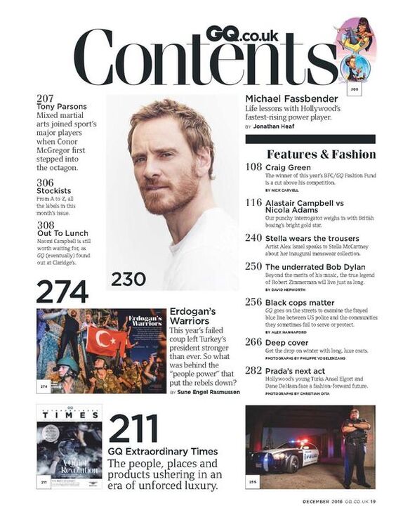
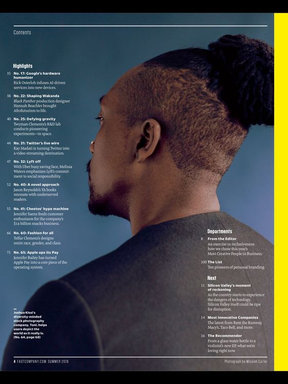
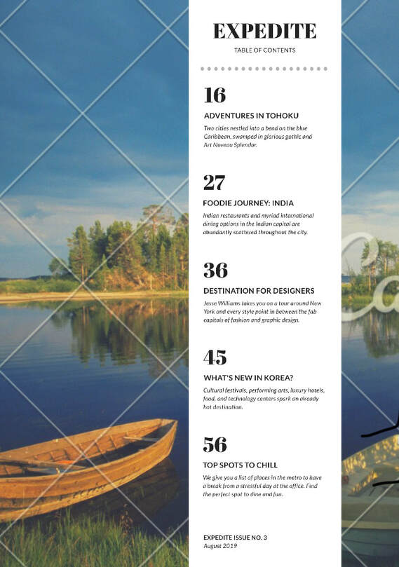
-1. I chose this magazine TOC because I really liked the way it integrated its images into the design/layout of the page, as it felt like the text was placed around the images without the images feeling out of place. I also thought it used its text very well, as the titles of the articles were slightly bigger than their descriptions to make them stand out more, and I liked the inclusion of the magazine’s masthead at the top of the page. Also, while I’m not sure if I’ll do the same for my table of contents, I did like the fairly minimalistic design of this one, as the black text on a white background made the content easy to read. This TOC does mostly match the concept of my intended front page, as I want to do a fashion magazine, and this is from GQ, a well-known fashion magazine. -2. I chose this TOC for the opposite reason I chose the one before it. I thought it was cool that unlike the last one, this table of contents page was largely composed of one single image, with no empty space. I liked that the text was small on the sides of the subject, but I did find it a bit difficult to read (I’m sure this wouldn’t be a problem with a physical copy of the magazine though). One design choice I quite liked was the inclusion of black and yellow lines on the top and left corners of the page respectively. I can only assume these make up the color scheme of the magazine, and I thought it was a nice choice, as the yellow and black compliment the dark blue background fairly well. This TOC matches the concept of my intended magazine page fairly well, because the articles are fashion related. -3. I chose this table of contents because I liked the fairly simple design, and how it integrated whitespace over the image/background to make the text easier to read. I also picked it because I liked that the page numbers were very big and attention grabbing. This TOC doesn’t match the concept of the magazine cover page I intend to make, but I mainly picked it for the concept/layout regardless. List of Possible Article Topics -The Hottest Fashion Trends of 2020! -Face Masks! Staying Fashionable During the Pandemic! -How to Accessorize! Jewelry, Sunglasses, and More.
0 Comments
Compare/Contrast of Notes
Similarities: -Both my notes, and the example candidate’s notes are organized by technical elements (camerawork, mise en scene, sound, and editing) to make them easier to refer back to. -Both my notes, and the candidate’s notes mention the use of medium shots during the conversation scene, and the camera panning down on Lester working on the washing machine. -We also both mentioned the use of low angle shots, although I can’t quite read what the candidate was referring to. -Both my notes, and the candidate’s notes mention the dark and dull setting and mise en scene. Differences: -I mention specific types of shots that are used throughout the clip in my notes a bit more than the candidate did in theirs. -The candidate’s response mentioned that the washing machine’s clattering was drowning out the sound of the wife’s hearing during the husband’s thinking, which was a good point. I did not include a comparable observation. -I mentioned that Lester’s clothes reflect his turn to crime throughout this clip, the candidate did not. -The candidate discussed the use of lighting in their notes far more than I did in mine, especially regarding the use of grey and blue light throughout the scene. -The candidate’s notes do not appear to include a note about the poster, as to where my notes do. -The candidate’s notes addressed the use of diegetic and non-diegetic sound, as to where mine addressed the fidelity of the sound. Compare/Contrast of Responses Similarities: -Both my writeup and the candidate’s writeup mention how the use of sound in certain moments emphasizes the silence of the other moments, albeit we each provide different examples. -Both my response and the candidate’s response mention the use of medium shots during Lester and Pearl’s conversation. -Both of our write ups discuss how the mise en scene establishes the mundane and dull nature of the character’s lives. Differences: -The candidate’s response describes the different technical elements like mise en scene and sound as they happen, as to where my response organizes them based on each technical element regardless of chronological order. -My write up briefly mentions the use of the musical score to heighten shock and suspense, as to where the candidate’s response appears to not mention the score. The candidate’s response describes the use of the washing machine’s rattling, and more importantly how it reflects Lester’s state of mind very well. -My response only briefly mentions the washing machine. The candidate discusses a scene of Lester at his office after he kills his wife that I don't believe was included in the clip we analyzed. -In my description of the mise en scene I mentioned how the juxtaposition of the two characters adds tension throughout the scene, the candidate’s write up does not appear to make a similar observation. Here is my first attempt at my magazine mockup and writeup. 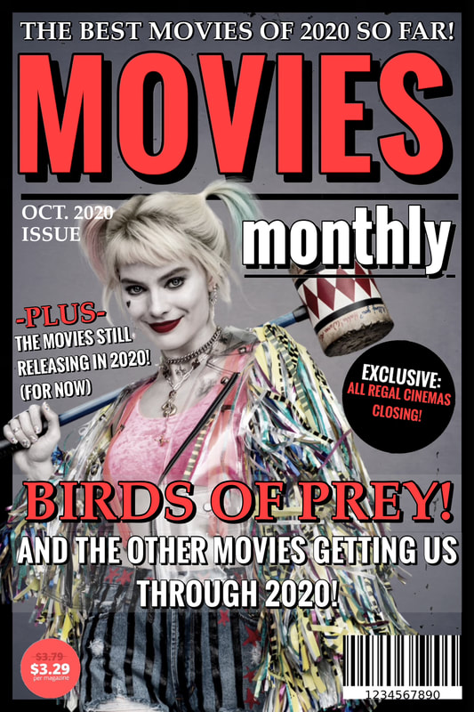 Title/Masthead: The title/masthead is “Movies Monthly” which literally means it is a movie magazine published once a month. The title suggests that it is a publication that primarily focuses on reporting current film, television, and entertainment information, with an emphasis on film.
Typography: The typography suggests that the magazine’s primary focus is on movies, which I (hopefully) achieved by typing the word “movies” larger than the other words, and typing it in all caps for emphasis. I also colored it in with the reddish pink color, which was used on particular words to draw the reader’s attention. I tried to give the magazine an inviting tone, so instead of using a bright red I tried to use a subtle color that was easier on the eyes. I also tried to give the magazine a mature tone/attitude by using fairly conventional fonts. Image: For the cover image I chose a human figure, that being Margot Robbie. She is dressed in costume as Harley Quinn, a character she played in Birds of Prey. She was posed or angled slightly to the left to prevent her from being blocked by the masthead. I also framed her over the black border instead of behind it to emphasize that she was the main focus of the magazine cover. I turned down the saturation on Harley Quinn quite a bit, because her costume was very bright, and distracted from the inviting tone I was going for. The subject (Harley) addresses the reader directly, because in the image I used she is staring directly at the camera, as opposed to staring off in the distance. I did this in the hopes of once again adding to the personal/inviting tone of the magazine. Language: The strapline can either be “The Best Movies of 2020! (So Far)” or “Birds of Prey! And the other movies getting us through 2020!” in my opinion, because both suggest that the focus of the magazine is on highlighting the better movies to come out of 2020. The use of the word “us” suggests both that the reader is interested in movies, and establishes a direct connection between them and the magazine. One of the rhetorical features evident on the cover lines is the extensive use of exclamation points to add dramatic effect. There is also the generally conventional use of two colors on the cover lines, with the bolder color being used to emphasize certain important words. One of the notable linguistic features is the use of multiple fonts to help separate blocks of text from one another. |
AuthorWrite something about yourself. No need to be fancy, just an overview. Archives
April 2021
Categories |
 RSS Feed
